
Internal preview tool
Rent to Own banners on a phone
Both banners rendered at the same phone width, side by side. The left frame is the sitewide banner as a phone actually sees it; the right frame is the 728×90 email leaderboard inside a message body.
Email banner version
390px wide screen — the banner stacks its artwork, headline, CTAs and urgency strip top to bottom.
Rent to Own vending machines
Vending Finance <enquiries@vendingfinance.com.au>
Hi there, rent-to-own machines are moving this month — here’s the quick version:
728×90 shrinks to about 390×48 inside an email this wide, with the link row underneath.
This is the 728×90 artwork twice as wide as a phone shows it, so the wording is readable. At real phone width it is the thin strip in the frame above.
The sitewide banner keeps its full wording and both call-to-action buttons at phone width. The email leaderboard is built for a 728px inbox column, so on a phone it reads as a compact strip — the image version is the one that never loses its text. Use the device button above the preview to see this page on a phone-sized screen, where the two frames stack one under the other.
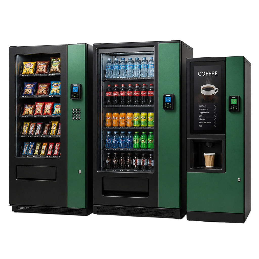
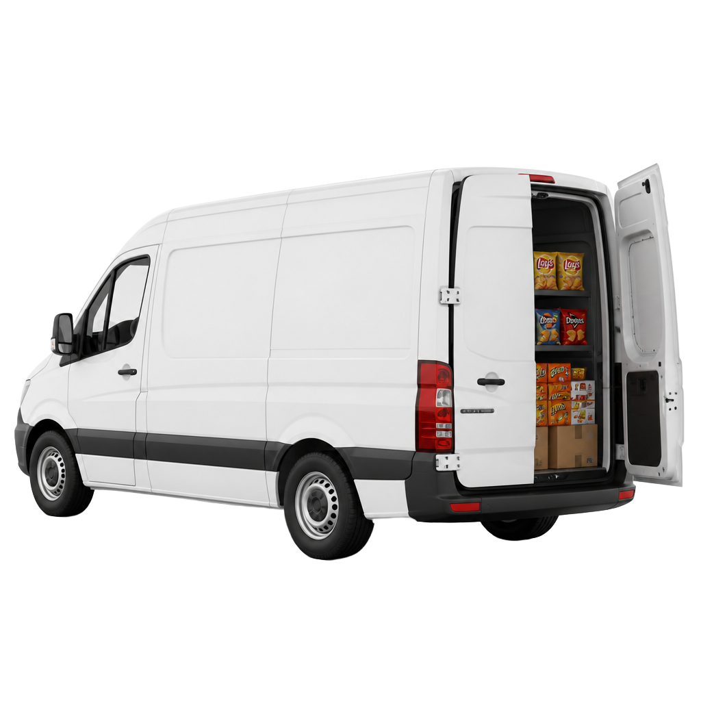
Secure yourRent to Own
Get vending machines on the road now and own them at the end of the term. New and established operators, Australia-wide — no financials required in many cases.
0% down options
Instant approval for qualified fleets